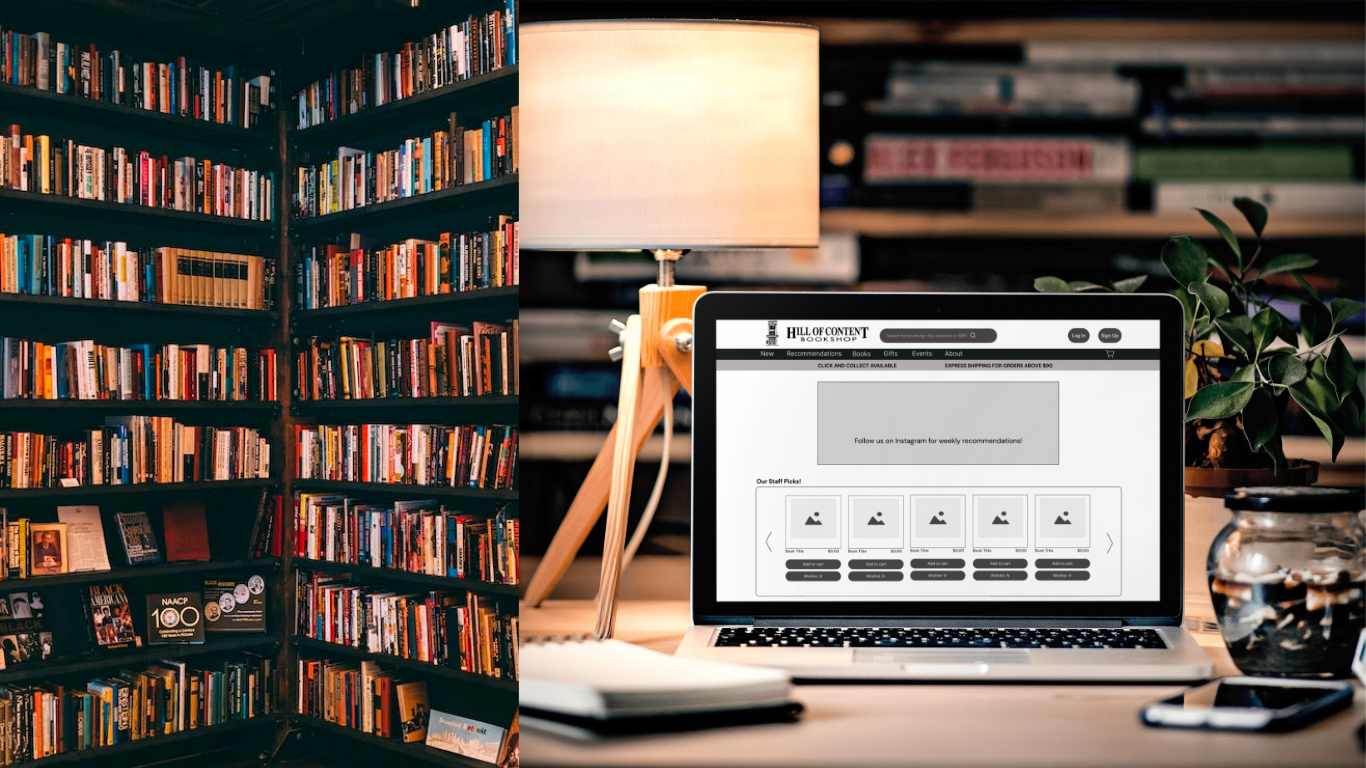
A Reader's Journey of Browsing in the Virtual World
Bringing Hill of Contents In-Store Experience to their Online Users
Overview
Hill of Content is Melbourne’s oldest bookstore, located in the heart of the city, they pride themselves on their outstanding customer service and wide variety of books.
What’s the problem?
Local and independent bookstores are struggling to compete with the ever-rising e-commerce giants. Although the Hill of Content has a loyal customer base and a strong reputation there is a visible disparity between their in-store experience and their online website.
How can I help?
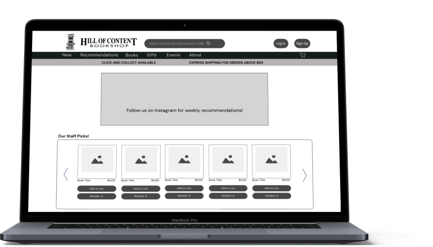
The goal is to assess and redesign the Hill of Content’s online shopping experience to reflect their brick-and-mortar service. Targeting the spontaneous selector, the aim is to improve their journey of browsing and purchasing the perfect book online, resulting in more in-store visitors.
Project type
Conceptual solo project
Duration
Two weeks
My Role
UX/UI designer
Methods
Heuristic evaluation
Competitive analysis
User flow
Sketching
Paper prototypes
Usability testing
Wire-framing
Prototyping
Tools
Figma
Pencil and paper
Post-it notes

Introducing our target shopper:
The Spontaneous Selector
Loves chance discoveries
Doesn’t specifically buy products because they are on-trend
Buys when something comes onto the radar, rather than looking for something
Makes purchase decisions quickly
Chooses the fastest delivery options
The existing website doesn’t invite browsing and discovery
Three key problems identified

Browsing
The current navigation does not allow the user to seamlessly browse through categories, which decreases the likelihood of a chance discovery.

Recommendations
The website has no recommendations. Although the Hill of Content is known for its expertise in providing recommendations, the website fails to reflect this part of their service. For the spontaneous selector, book recommendations would be essential for them to happen upon a chance discovery in a short time.

Check out
Lastly, there is no option to check out as a guest, severely hindering the ability to check out quickly and ultimately discouraging visitors from completing their purchases.
The proposal
Giving the user every opportunity to discover
By creating more recommended lists for the user to browse and making it easier for them to navigate through the menu, we can achieve the goal of the spontaneous selector finding their ideal book and checking out. Improving the online experience will also result in more users visiting the store.
How can I achieve this?
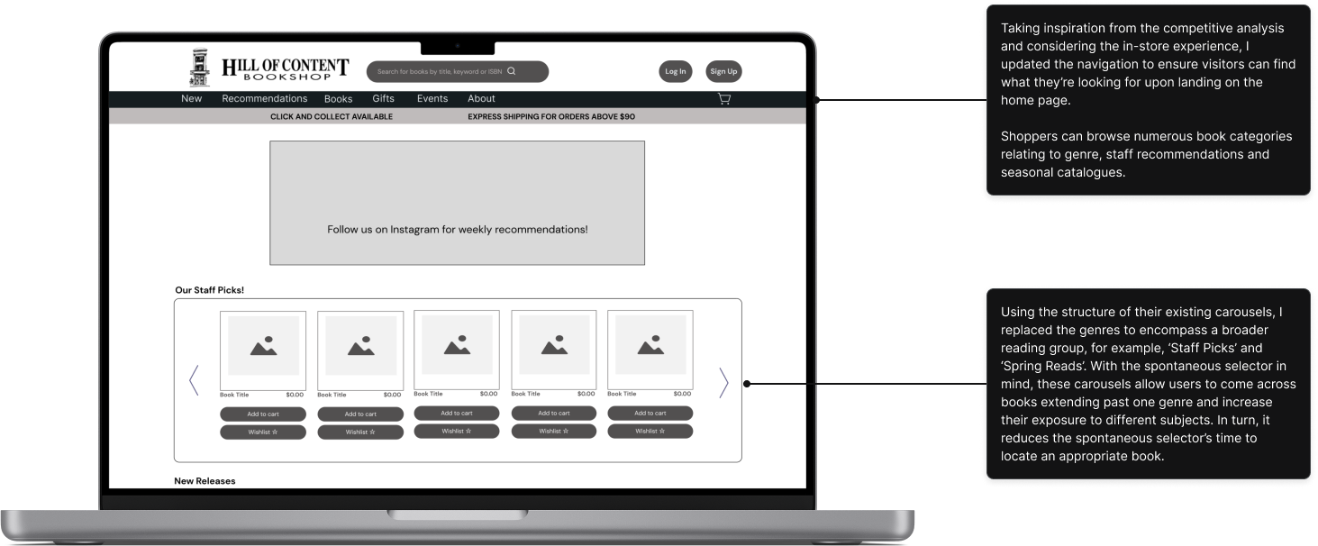
My proposed solution is to move the book categories into the navigation bar. Having multiple tabs in the navigation where guests can browse books increases their chances of finding a suitable book. Moving the categories to the navigation bar also prevents the user from having to scroll down to discover. I will also adjust their carousels to include curated book categories not bound by genre. Having categories like “Spring Picks”, “Staff Recommendations”, and “All Time Favourites” allows the user to come across multiple genres in one place. Finally, I plan to streamline the process by allowing users to check out as guests and complete their purchases in as few steps as possible.
The inspiration

Waterstones
Has a separate recommendations tab in the navigation bar, titled “Our Favourites”
Book categories in navigation bar
More specific and captivating book categories throughout homepage

Barnes & Noble
“We Recommend” category found under the main title Books in navigation bar
Book categories is the first option in the navigation bar
More specific and captivating book carousels throughout homepage
What are competitors doing well?
The navigation on both websites appeal to the user. They prioritise book categories and subcategories, each clearly labelled and defined. This allows the user to achieve the most critical task: finding and purchasing a book. Both home pages lit up with categories to captivate the user, “Everyone’s Talking About…” “Our Best Paperbacks” or “Fall into a Good Book”; the homepage easily guides those searching for a book to their perfect read.
What does Hill of Content offer?
Having visited Hill of Content many times over the last 15 years, I was familiar with the customer experience. The carefulness of the staff, knowing when to approach you if you are lost or leaving you engulfed by the book you’ve recently picked up. The employees spend time understanding what you are after and provide excellent recommendations. This wonderful experience was the one thing missing from their online store.
Let’s simplify the process for the user!
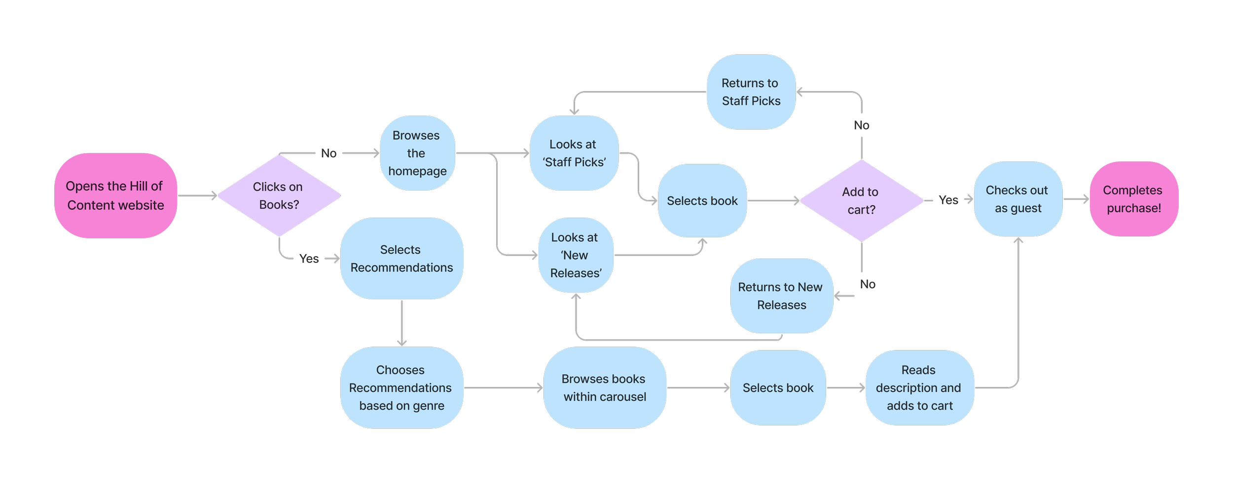
Redesigning the home page

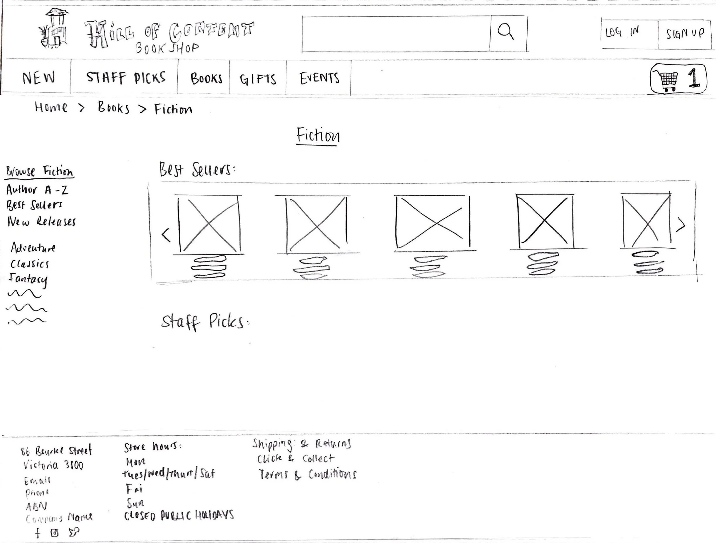
Using the new user flow as a guide, I began to sketch my first ideas for the redesign. As seen in the sketches above, I focused on the homepage and navigation bar as well as the Fiction landing page. These sketches were used during the first usability test.
Key takeaways from usability testing

The navigation is too overwhelming

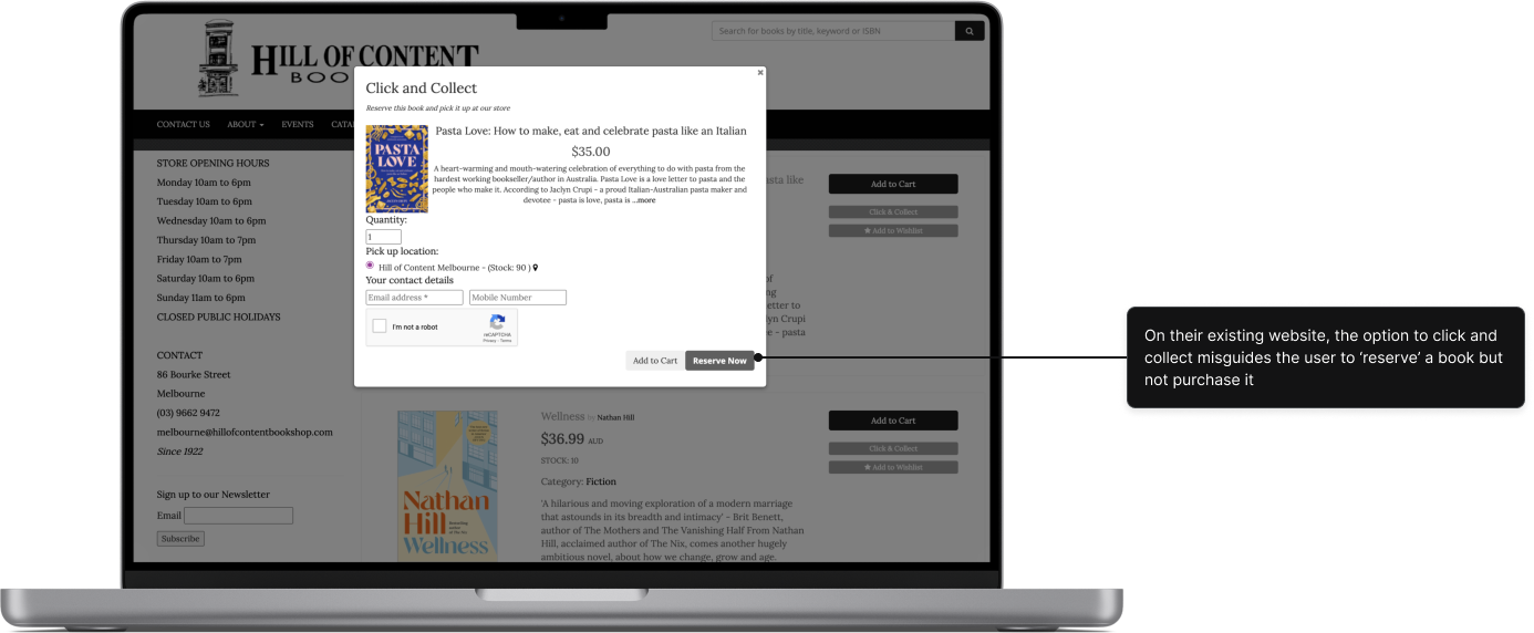
How do I know when/where to collect my order?
The initial design for the navigation bar moved all the existing categories on Hill of Content’s website to the main menu. However, upon conducting usability testing I discovered this was far too overwhelming and would likely sway the spontaneous selector from carrying out their task. Reducing their choices within the menu by grouping similiar categories under a broader term, provides a clearer path for the user.
For Click & Collect users it was not clear enough how, where and when they could collect their order. Since this option encourages users to visit in-store, it was imperative to provide information such as opening hours and store location for a smooth pick-up.
The outcome
A seamless journey from the homepage to the checkout with many opportunities along the way to discover. Users can find options to browse eye-catching categories curated by the staff on every page.
Home page
Before

Click & Collect
Before
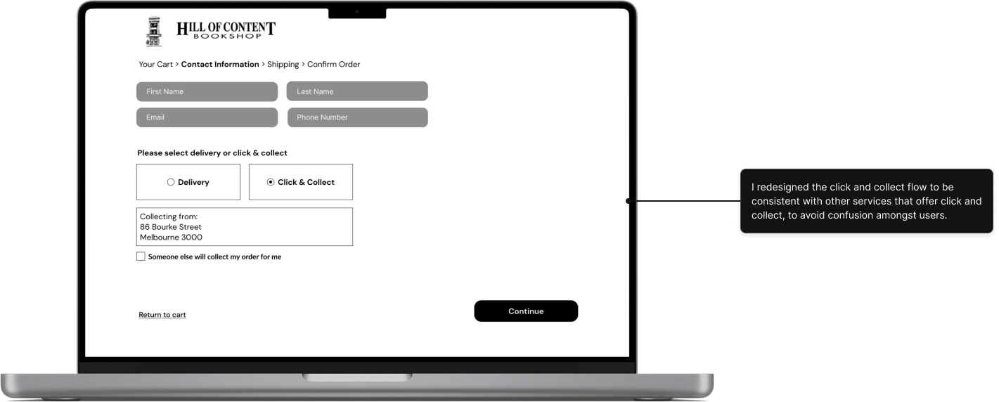
After


After
Check out
What’s next?
1. If I were given more time on this project I would conduct further usability testing with more participants. Specifically, to gauge how users find the current organisation of content and the time it takes them to complete their task
2. Confirm with the client if the staff are able to provide and update book recommendations for their site on a regular basis. If this is a possibility, understand if there are any limitations
3. Adapt the website to be responsive on mobile
What did I learn?
Consider how the information is sorted and organised
I wanted to give the user easy access to discover a book wherever they were on the website. However, some crucial features were missing that would’ve helped the user personalise their experience and speed up the search process. Giving the user autonomy to sort and filter their search in order to refine their results at their leisure would have benefited them greatly.
Test early
It is important to test your designs as early as possible. Using paper sketches to test with users allowed me to apply changes easily and understand the basic functionality.
If you try to please everyone, you will please no one
During the usability testing and iteration phase, I heard a lot of conflicting feedback. At first, it was difficult to decide what should be taken onboard and what could be cast aside. For a moment I felt the need to please everyone. Remembering who I was designing for and the goals of both the business and the user, made me feel confident about the choices I needed to make.